What colors work best for paper art props decoration?
Jul 07, 2025
Leave a message
When it comes to paper art props decoration, the choice of colors plays a pivotal role in creating the desired atmosphere and visual impact. As a dedicated supplier of paper art props decoration, I've delved deep into the world of colors and their effects on different settings. In this blog, I'll share insights on what colors work best for various paper art props, drawing from both aesthetic principles and practical experience.
Understanding Color Psychology
Before we dive into specific color choices, it's essential to understand the basic principles of color psychology. Different colors evoke different emotions and associations, which can significantly influence the overall message of your decoration.
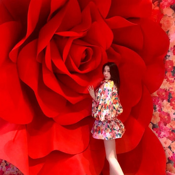
- Red: Red is a powerful and attention - grabbing color. It symbolizes passion, love, and energy. In paper art props, red can be used to create a sense of urgency or celebration. For example, red paper roses can be a stunning centerpiece for a Valentine's Day event or a Chinese New Year celebration.
- Blue: Blue is often associated with calmness, trust, and stability. Light blue can create a serene and relaxing atmosphere, making it suitable for spa or wellness - themed events. Dark blue, on the other hand, can add a touch of sophistication and elegance, perfect for corporate events or formal dinners.
- Yellow: Yellow represents happiness, optimism, and creativity. It is a bright and cheerful color that can instantly lift the mood. Yellow paper stars or confetti can be used to add a playful touch to children's parties or creative workshops.
- Green: Green is the color of nature, growth, and harmony. It can bring a sense of freshness and tranquility to any space. Green paper leaves or vines can be used to create a natural - themed backdrop for garden weddings or environmental awareness events.
- Purple: Purple is associated with royalty, luxury, and mystery. It can add a touch of elegance and sophistication to high - end events. Purple paper drapes or orbs can be used to create a regal atmosphere for galas or fashion shows.
Colors for Different Occasions
Weddings
Weddings are one of the most popular occasions for paper art props decoration. The color scheme should reflect the couple's personality and the overall theme of the wedding.

- Classic White and Gold: White symbolizes purity and innocence, while gold represents luxury and elegance. A combination of white paper flowers and gold accents, such as gold - leafed paper lanterns, can create a timeless and sophisticated look for a traditional wedding.
- Pastel Colors: Soft pastel colors like pink, lavender, and mint are popular for spring and summer weddings. They create a romantic and dreamy atmosphere. Pastel - colored paper butterflies or streamers can add a delicate touch to the venue.
- Bohemian Earth Tones: For a more rustic or bohemian - style wedding, earth tones like brown, terracotta, and mustard yellow are a great choice. These colors blend well with natural elements such as wood and greenery. Earth - toned paper pom - poms or macramé paper hangings can enhance the bohemian vibe.
Corporate Events
Corporate events require a more professional and sophisticated color scheme.
- Neutral Colors: Black, white, and gray are classic neutral colors that convey a sense of professionalism and reliability. A black and white paper backdrop with gray accents can create a sleek and modern look for a business conference or product launch.
- Brand Colors: Incorporating the company's brand colors into the paper art props is a great way to reinforce brand identity. For example, if a company's brand colors are blue and orange, using blue paper banners and orange paper signage can create a cohesive and branded look.
Children's Parties
Children's parties are all about fun and excitement, so bright and vibrant colors are the way to go.
- Primary Colors: Red, blue, and yellow are the primary colors that are easily recognizable and appealing to children. Using primary - colored paper balloons, masks, and hats can create a festive and energetic atmosphere.
- Rainbow Colors: A rainbow of colors can add a sense of magic and wonder to a children's party. Rainbow - colored paper streamers or a rainbow - themed paper backdrop can be a hit with kids.
Colors for Different Types of Paper Art Props
Backdrops
Backdrops are a great way to create a focal point in a venue.
- Monochromatic Backdrops: A monochromatic backdrop uses different shades of the same color. For example, a backdrop made of different shades of blue can create a calm and cohesive look. Monochromatic backdrops are particularly effective for minimalist or modern - style events.
- Contrasting Colors: Using contrasting colors in a backdrop can create a bold and eye - catching effect. For instance, a black and white geometric paper backdrop can make a strong visual statement. Check out our Giant Rose Background Props for some stunning backdrop options.
Decorative Cut - outs
Decorative cut - outs can be used to add details and accents to a space.
- Complementary Colors: Complementary colors are colors that are opposite each other on the color wheel, such as red and green or blue and orange. Using complementary colors in decorative cut - outs can create a vibrant and dynamic look. For example, red paper hearts and green paper leaves can be used together for a Valentine's Day or Christmas decoration.
- Analogous Colors: Analogous colors are colors that are next to each other on the color wheel, such as blue, blue - green, and green. Using analogous colors in decorative cut - outs can create a harmonious and soothing look.
Party Favors
Party favors are a small but important part of any event.
- Coordinating Colors: The colors of the party favors should coordinate with the overall color scheme of the event. For example, if the event has a purple and silver color scheme, purple paper bags with silver accents can be used as party favors.
Tips for Choosing the Right Colors
- Consider the Venue: The color of the venue walls and the existing decor should be taken into account when choosing paper art props colors. You want the props to complement the venue, not clash with it.
- Think About Lighting: Lighting can significantly affect the way colors appear. For example, warm lighting can make colors look more vibrant, while cool lighting can make them appear more subdued. Consider the type of lighting in the venue when selecting colors.
- Test Samples: Before making a large order, it's a good idea to request color samples. This way, you can see the actual colors in person and ensure they meet your expectations.
Conclusion
Choosing the right colors for paper art props decoration is a combination of art and science. By understanding color psychology, considering the occasion and the type of props, and following some practical tips, you can create a visually stunning and impactful decoration. As a supplier of paper art props decoration, I'm committed to providing high - quality products in a wide range of colors to meet your needs. Whether you're planning a wedding, a corporate event, or a children's party, we have the perfect paper art props for you. Check out our Activity Decorative Paper Art for more inspiration.
If you're interested in purchasing our paper art props or have any questions about color selection, please feel free to contact us. We're here to help you bring your decoration ideas to life.
References
- "Color Psychology: Understanding the Meaning of Colors" by Verywell Mind
- "The Complete Guide to Color Schemes" by Canva
- "Event Decorating Ideas: How to Choose the Right Colors" by Eventbrite