What are the rules for color matching in paper art props decoration?
Jan 05, 2026
Leave a message
As a dedicated supplier of Paper Art Props Decoration, I've witnessed firsthand the transformative power of well - chosen color combinations. In the world of paper art props, color isn't just an aesthetic choice; it's a strategic tool that can evoke emotions, set the mood, and enhance the overall visual impact of any event or space.
Understanding Color Theory Basics
Before delving into the specific rules for color matching in paper art props, it's essential to have a solid grasp of basic color theory. The color wheel is the cornerstone of this theory. It consists of primary colors (red, yellow, and blue), secondary colors (orange, green, and purple), and tertiary colors.
Complementary Colors
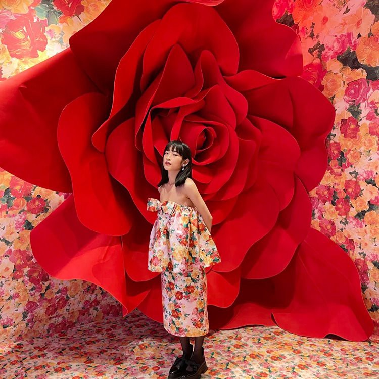
Complementary colors are opposite each other on the color wheel. For example, red and green, blue and orange, and yellow and purple. Using complementary colors in paper art props creates a high - contrast and visually striking effect. Picture a set of large paper flowers where red roses are paired with green foliage. The sharp contrast between the two colors makes each stand out, adding a lively and dynamic feel to the decoration. In a corporate event setting, we could use blue and orange paper lanterns as part of Activity Decorative Paper Art. The blue lanterns, representing stability and trust, combined with the energetic orange ones, create an engaging and balanced atmosphere.
Analogous Colors
Analogous colors are adjacent to each other on the color wheel. These color combinations offer a harmonious and soothing look. For instance, a palette of yellow, yellow - orange, and orange can be used to create a warm and inviting ambiance. In a baby shower, we could design paper art props such as wall hangings and table centerpieces using analogous shades of pastel pink, peach, and light orange. This soft color scheme evokes feelings of tenderness and celebration, perfectly fitting the theme of a new arrival.
Monochromatic Colors
Monochromatic color schemes use different shades, tints, and tones of a single color. This approach provides a sophisticated and elegant look. For a high - end fashion event, we might use various shades of black and white paper art props. From black and white geometric cut - outs to white paper streamers with black accents, the monochromatic scheme exudes a sense of luxury and modernity.
Considering the Event or Space
The context in which the paper art props will be used plays a crucial role in color matching.
Corporate Events
Corporate events often require a more professional and refined color palette. Neutral colors like white, black, gray, and beige are commonly used as a base. These can be accented with corporate colors, which are usually associated with the brand's identity. For example, if a company's brand colors are navy blue and silver, the paper art props for their annual meeting could include navy blue table runners, silver paper flowers, and white place cards with silver lettering. The Giant Rose Background Props in corporate colors can create an eye - catching backdrop for presentations and networking sessions.
Weddings
Weddings are typically a celebration of love and romance, and the color palette reflects this. Soft pastels such as blush pink, lavender, and mint green are popular choices. They create a dreamy and elegant atmosphere. However, some couples may opt for a more bold and contemporary color scheme, like a combination of deep red and gold. Paper art props for weddings could range from delicate paper pom - poms to elaborate paper wedding arches, all in the chosen color palette.
Children's Parties
Children's parties call for bright and fun colors. Primary colors like red, blue, and yellow are go - to choices. They are visually appealing to kids and convey a sense of excitement. Paper art props for a children's party could include colorful paper balloons, animal - shaped paper cut - outs, and party hats in a variety of vivid hues.
The Impact of Lighting
Lighting can significantly affect how colors appear in paper art props. Natural light can bring out the true colors, making them look vibrant and fresh. In contrast, artificial light, such as fluorescent or incandescent bulbs, can alter the perception of color.
In a well - lit daytime event, bright and bold colors can be used without losing their intensity. However, in an evening event with dim lighting, darker and more saturated colors may be more appropriate. For example, if you're using paper art props in a nightclub for a special event, deep purple and black paper pieces with some neon accents will stand out better under the club's mood lighting compared to light pastel colors.
Creating a Focal Point
A key rule in color matching for paper art props is to create a focal point. This can be achieved by using a dominant color or a unique color combination in a specific area.
For example, in a large event hall, a giant paper flower wall in a bold color like hot pink can serve as the focal point. The rest of the paper art props in the hall, such as smaller paper lanterns and streamers, can be in complementary or analogous colors to support and enhance the focal point. This creates a visual hierarchy and draws the viewer's attention to the most important part of the decoration.
Balancing Colors
Achieving a balance between colors is essential. Too many bold colors can create a chaotic and overwhelming look, while too many neutral colors can make the decoration seem dull.
One way to balance colors is to follow the 60 - 30 - 10 rule. Allocate 60% of the color to a dominant color, 30% to a secondary color, and 10% to an accent color. For instance, if you're decorating a living room with paper art props for a party, the walls could be adorned with white paper streamers (60%), the table centerpieces could be made of blue paper flowers (30%), and small yellow paper stars could be used as accents (10%).
Conclusion
Color matching in paper art props decoration is a complex yet rewarding art form. By understanding color theory, considering the event or space, factoring in lighting, creating a focal point, and balancing colors, you can create stunning paper art prop decorations that leave a lasting impression.
If you're interested in bringing your paper art prop decoration ideas to life, we'd love to discuss your project. Whether it's a large - scale corporate event or an intimate wedding, our team of experts can help you choose the perfect color combinations and design the most suitable paper art props. Get in touch with us to start the procurement and design process that's tailored to your specific needs.
References
- Color Matters. A website dedicated to color theory and its applications.
- Design textbooks that cover graphic and interior design principles related to color.
- Real - world event decoration case studies and industry reports.